Wiped out.


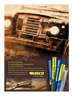
This campaign lost out to another campaign. But I preferred this one.
The art direction by David Watts might be what does it for me. From the color palette to the balance of the various pieces within the layout to the way the product shots are incorporated without looking cheesy — this stuff is Tube City (and there's no greater compliment than that).
When you work with really talented people, which I am blessed with the opportunity to do every day, things you helped create become much more than what you saw in your head.
To the stock photo places we got the images from: I'm sorry.


